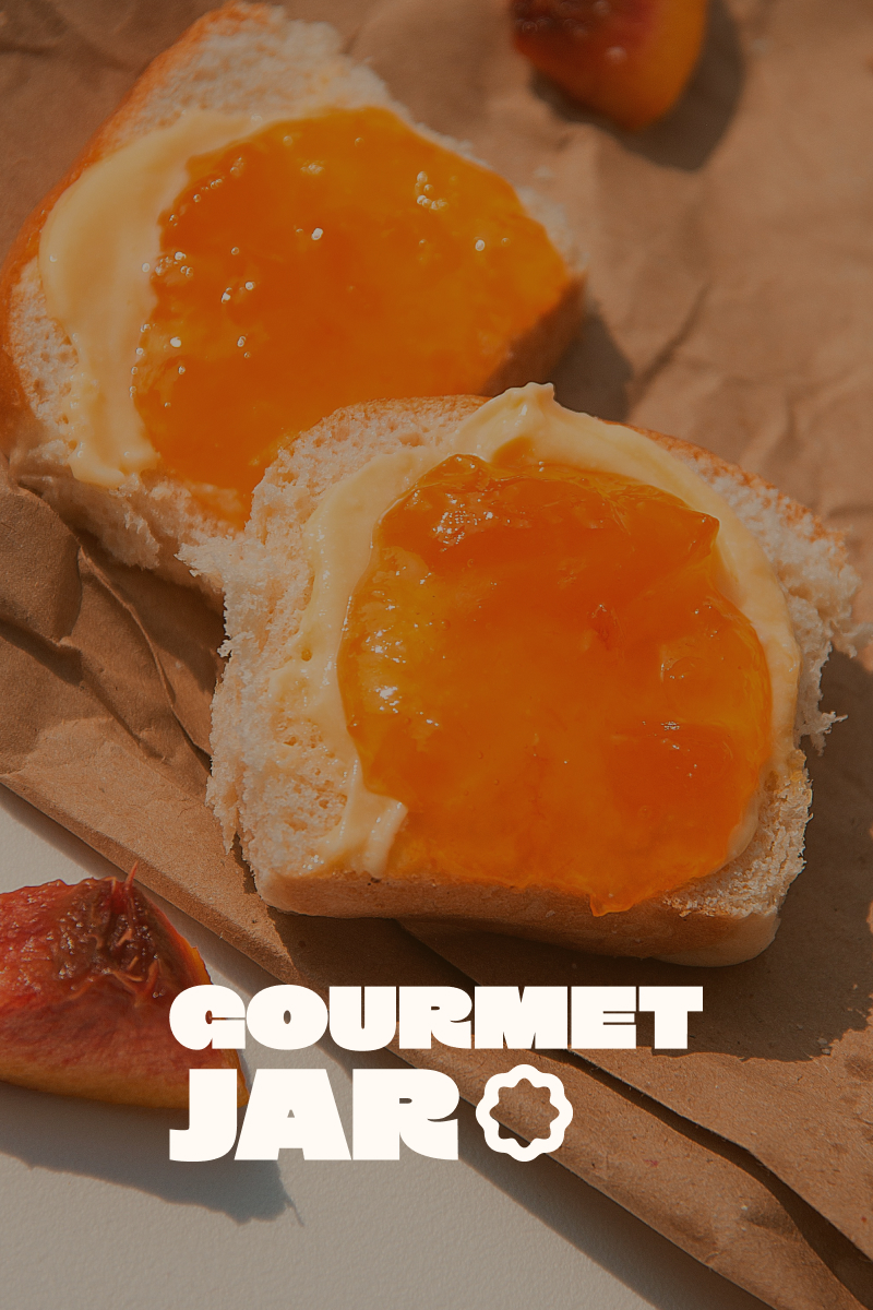
The challenge Create a distinctive identity and packaging system that could stand out in a saturated grocery category while communicating craft, quality, and trust at shelf.
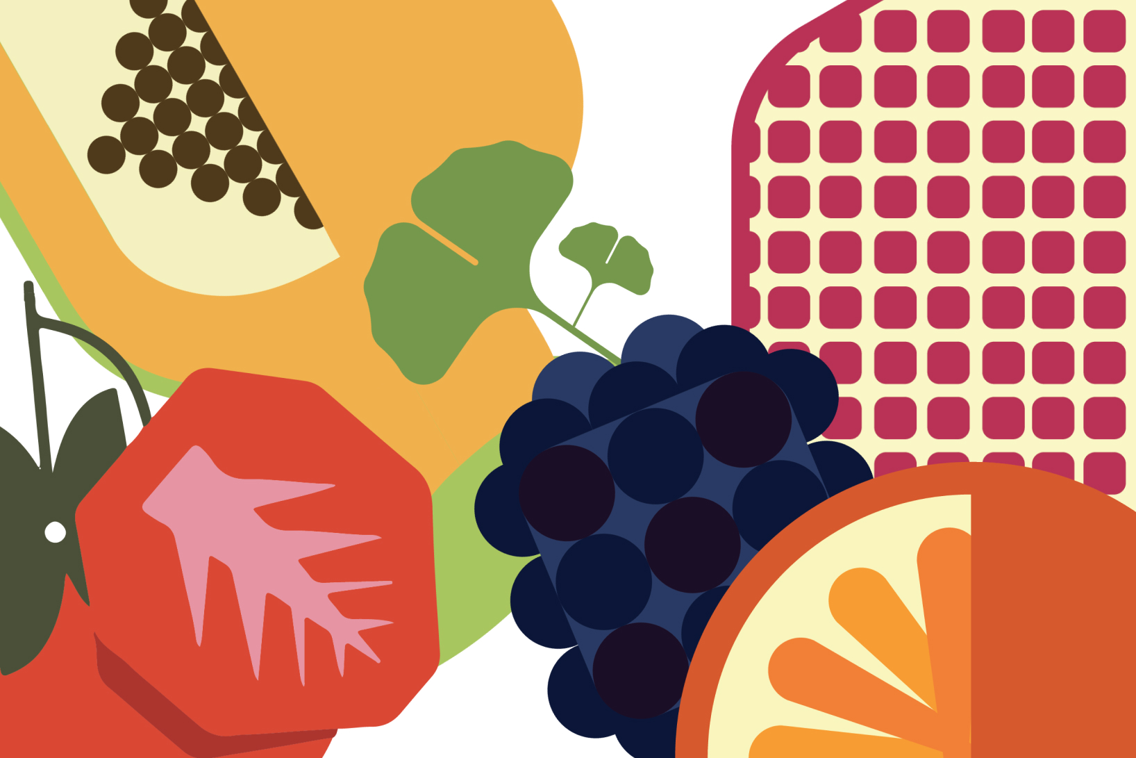
Illustrative IdentityPositioned the brand around storytelling first — focusing on provenance, people, and process before designing visual assets.
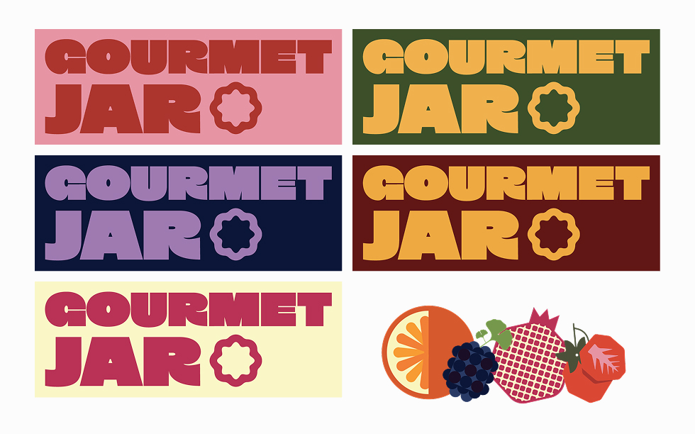
Developed a scalable packaging architecture including label structures, typography hierarchy, color coding, and repeatable templates for multiple SKUs.
A small-batch, women-led food brand built around handcrafted recipes, farm-sourced ingredients, and an authentic maker story communicated with a scalabale packaging and multiple touchpoints
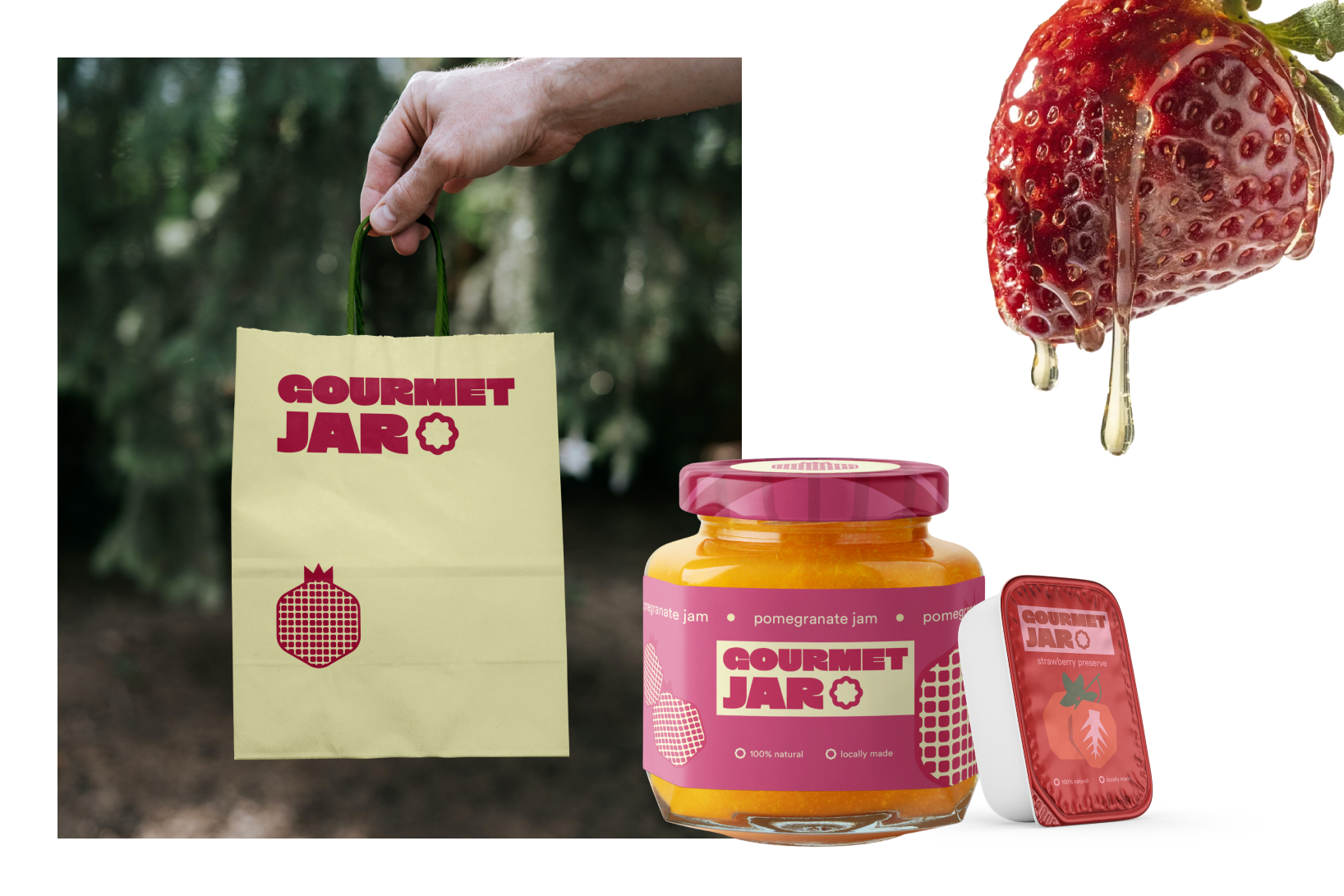
Execution
Delivered packaging design, shelf-ready labels, sales collateral, and supporting brand materials across print and digital.
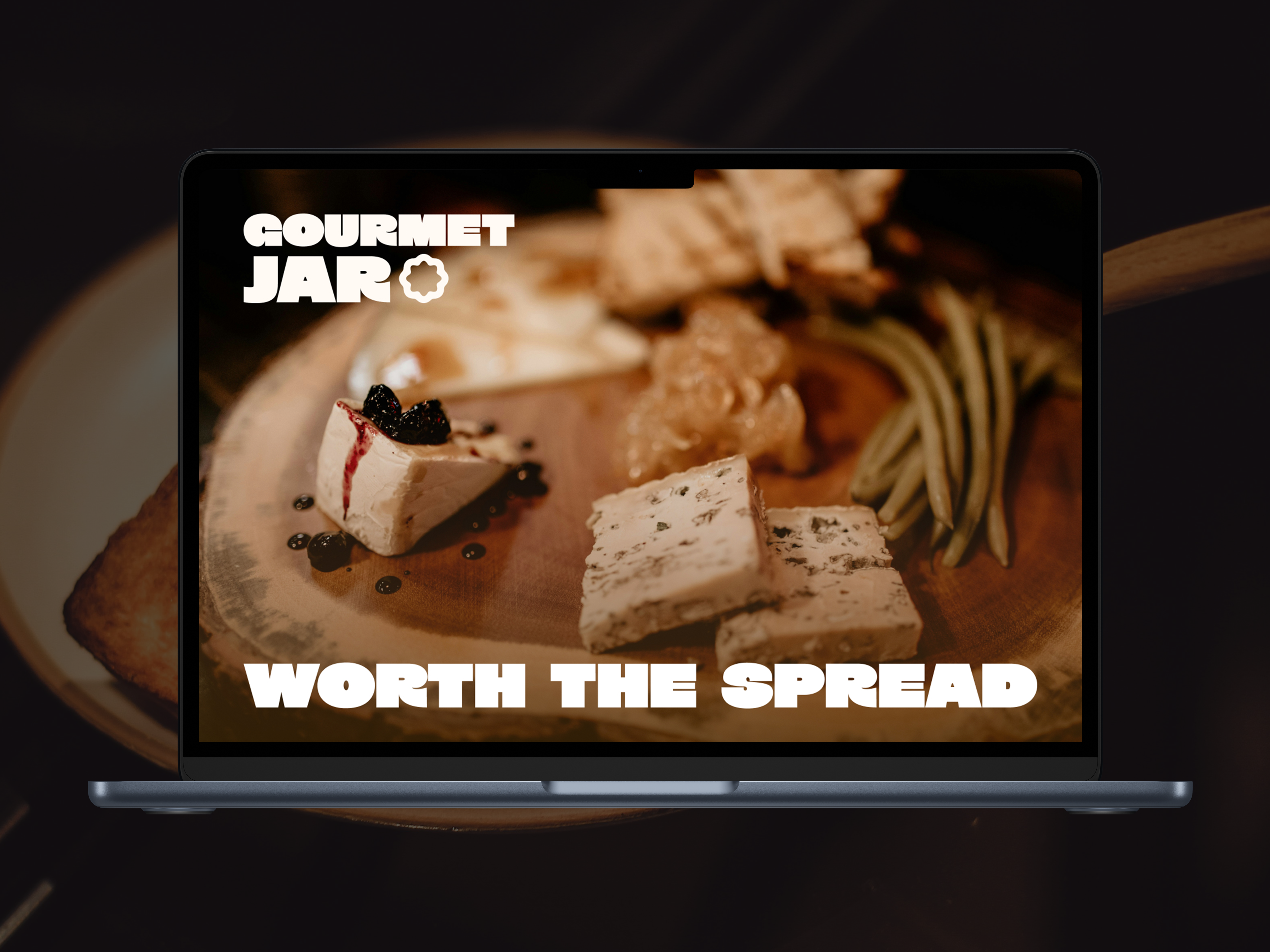
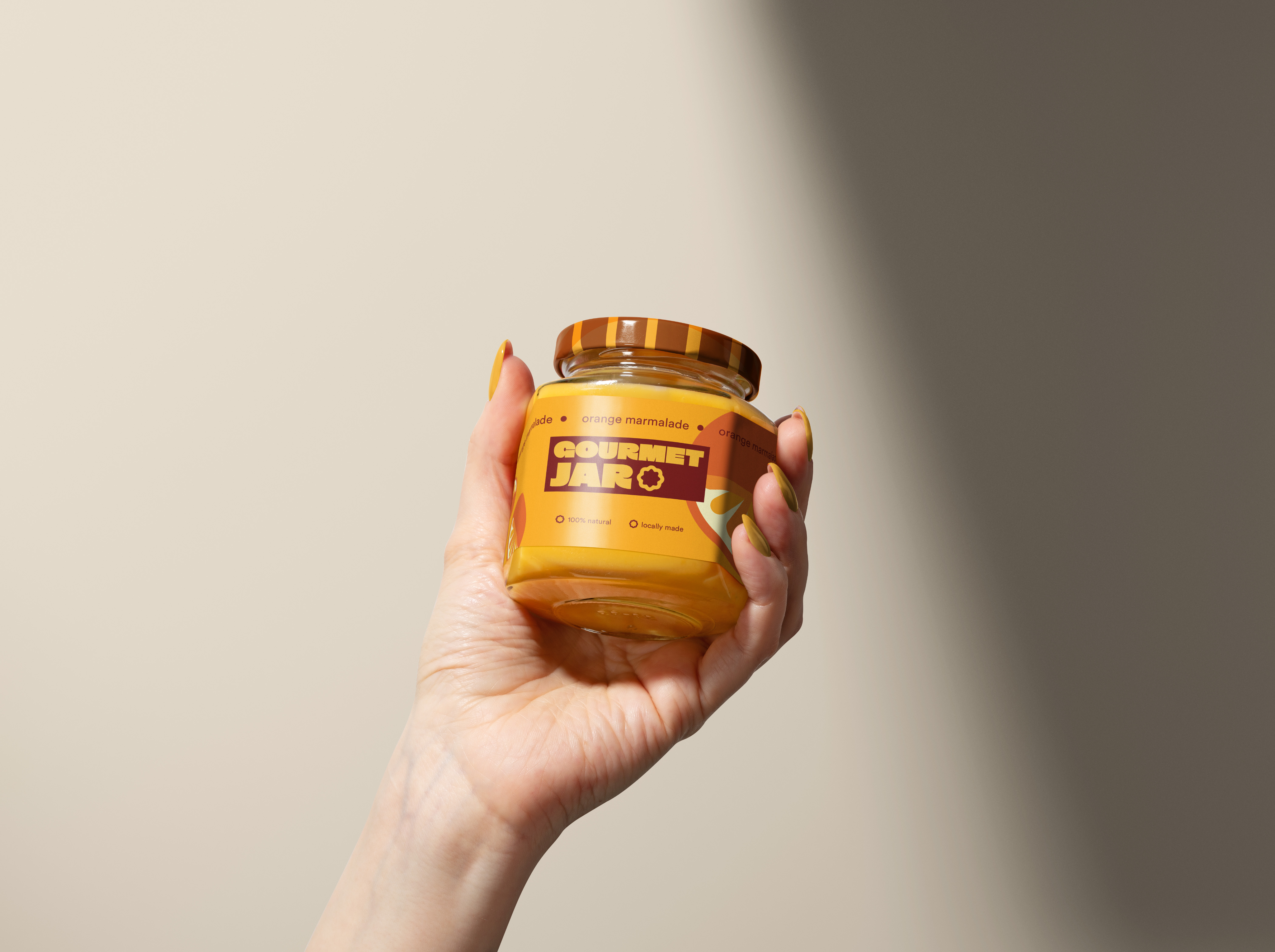
Reinforced my belief that strong brand systems — not one-off visuals — create clarity, scalability, and long-term impact in physical retail environments.